Collections
Flecks of Light / Sophie Fahey, Nelson Tsui, Kitty Maryatt, Malia Bence, Marissa Remy Dorit, Christopher Eskilson
Accordion books
"The typography students researched ancient and medieval pigments, color choices made by painters and how to mix inks for letterpress printing. The resulting extravaganza was printed in 12 pt. Goudy Modern on Mohawk Superfine Cover. The images were cut into linoleum, and some were brushed with acrylic gel medium. One image is an homage to Mark Rothko and a second is to Sonia Delaunay. The folded pages were glues, and colorful museum board covers were attached"--Colophon.
"Written and produced by the students in the Typography and the Book Arts class.
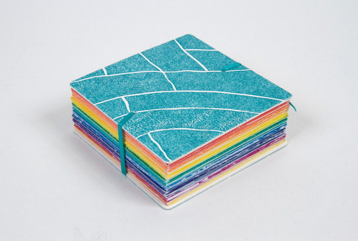
"Students researched medieval color pigments, because the names of the pigments are so evocative, and the process of making the pigments so onerous.
"We asked our new painting professor Kasper Kovitz to give a talk about how painters decide on colors in painting, especially when the images are abstract. We looked at books on Turner, Rothko, Sonia Delaunay, Malevich, and Diebenkorn. Next we looked at the difficulties of color printing by letterpress, especially interesting since the students are so used to digital printers which so easily print in color.
"After long discussions and the making of several models, the students decided on their color palette: the rainbow. They were inspired by an origami-folded book and decided to choose that structure. The book springs open, so the magnets hold the pages together until you want to open it. The magnets are useful for when you want to hand the book for display." -- Scripps College Press website